Following our conversation about our topic Inter- we decided how are we going to demonstrate that across our zine. Inter- the prefix means between, among, mutually, reciprocally.
Thus first we decided to show the inter- nature of our zine through its structure.
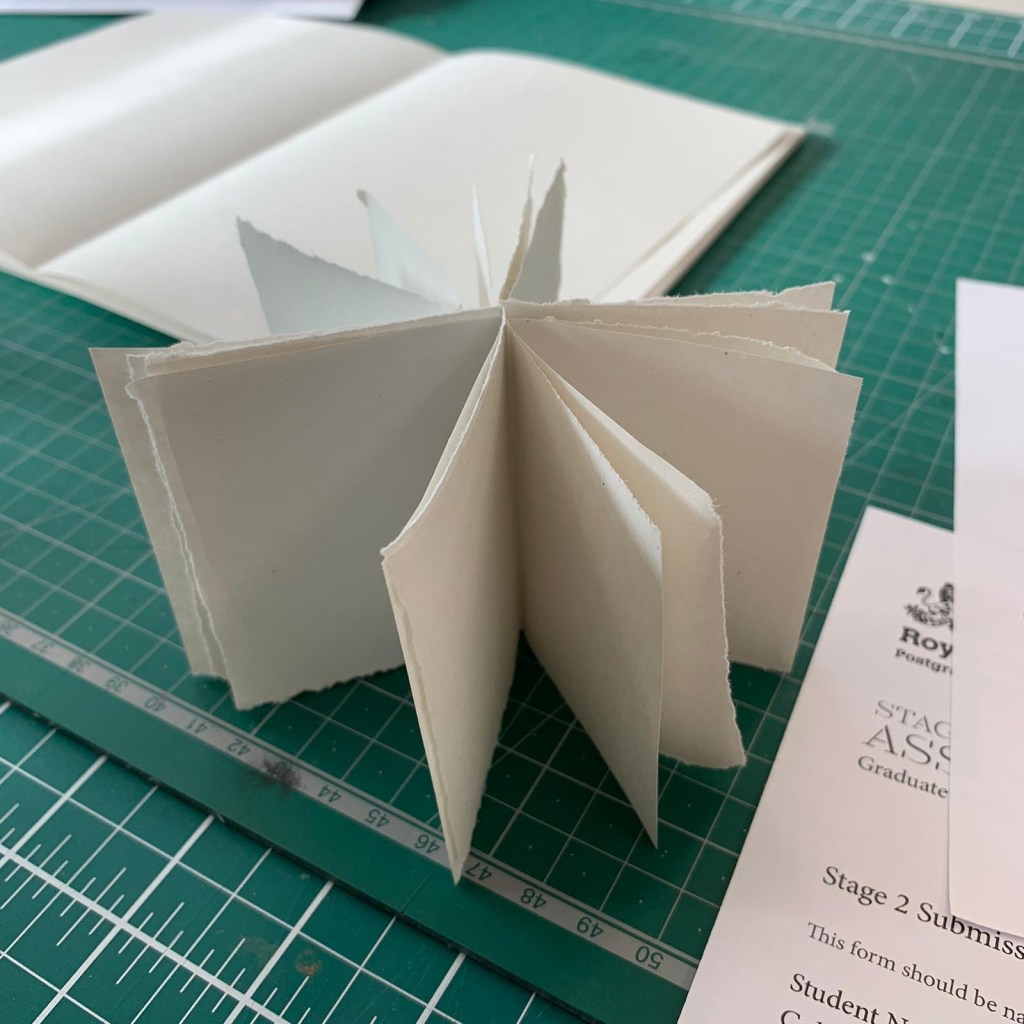

These are the two mockups that we created. Our zine will be in a form of a concertina with 10 A5 sheets for each member of our group. When standing, it creates a star like structure to represent the constellation. When pulled across, it creates a single seamless line. Each page can be viewed with a different page, even though it will be published in a linear manner, one can chose to not read it in a non linear way due to its structure.
Each layout is one’s own, we are not following a consistent pattern apart from the basic outline of the structure. The typography, however, is consistent for the ease of the viewers.
In support of the strikes at RCA, we decided to print our zine from an external source. These are the final details and print techniques our group agreed on: Silk paper in 250gsm for the main body of print. GF Smith White Frost 350gsm for the cover. The texture is Buckham and we shall be using spot varnish on the cover as well on some images inside. The pages will have to be bound manually.
